
I’ve designed scores of logos for organizations and products over the course of my career. These are just a few of my favorites.
Logos are a peculiar item for me. I charge a lot of money to create them. Certainly more than one might pay on a site like 99designs or fiverr.com, simply because it takes a lot of time to do a proper job of it.
I’ve seen a lot of logos produced by crowdsource boards, and with very few exceptions, I tend to feel that both the creators and the buyers were cheated, though mostly the buyers.
The creators were cheated because, for such little compensation, they work fast and dirty, often producing work that can’t possibly be their best (if its even their’s at all), and are not able to take it through to a level of completion that would allow them to feel really good about the work that they do.
The buyers were cheated, not because they aren’t getting a logo that they love, but because they aren’t getting the artist’s best work (again, assuming the art isn’t stolen). And to make it worse, often new business owners don’t realize that purchasing ‘a logo’ only gives them the starting block on which an identity still needs to be crafted.
If you are looking to hire someone to create a logo for you, here are some things to keep in mind.
Logos Occupy Various Spaces
Can it fit in a square? How about long and skinny? Can the mark stand alone from the text? How about the other way around?

These logos were designed w/ multiple configurations in order to handle various applications.
Logos Exist at Various Sizes
Logos often do well enlarged on a billboard or the side of a truck or building. How about when they are very tiny (or seen from a distance)?

These Tanner Reigning Horses and First Strategy Group logo designs have simplified versions for use in tight spaces and small sizes.
Logos Can’t Be Restricted to White Paper
So the logo looks great on your letterhead. What happens when you put it against black? Or a mid-toned gray?
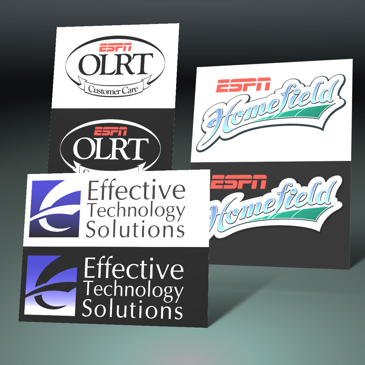
OLRT reverses black for white on darker backgrounds, but keeps the red ESPN. The homefield logo is designed w/ a black stroke that allows it to live on dark or light backgrounds, and the ETS logo uses completely different colors depending on its background.
Logos Live in a World Full of Print Variety
What if your logo can only be one color? While far less likely to degrade to basic black and white in today’s world, it does still happen. Also, many promotional items can only have one color applied to them. And only logos that can be printed in one color do well with foil embossing.

Both of these logo designs have variations for full color, flat color, gray scale and one color printing.
Some Logos Carry Multiple Meanings
Far less common with company logos, but more common with product or service logos, the same logo in varying colors or configurations may carry different meanings; service levels, packages, or product quality.

ESPN’s Self Service logo was created in a variety of colors for various applications.
Logos Are Part of an Identity System
Finally, logos are only a portion of any brand’s identity. At some point, though not necessarily right away, logos should become part of a larger, overall branding vision, which includes colors, typography, extra-logo markings, spacing, and specific examples of what NOT to do.

Logo & Identity Guide for PACT (no longer in business).
In Summary
All of that said, while I do take on logo creation jobs, I prefer creating logos in parallel with larger projects. This gives the ideas time to germinate without the rush, with the clients along for the creative journey, experiencing the process themselves. In this way, everyone is generally far happier with the end results, and the logo is stronger for it.
