Some interactions are simple enough for static images. Others do better when animated.
Prototypes of interaction designs serve many purposes.
First, they save money. When creating new solutions, its often difficult to know if it will actually work, and sometimes you need to try out several ideas before settling on the ‘right’ one. It turns out that you can construct any number of prototypes and test them for less money than creating one, and potentially finding out too late that it doesn’t work the way you want it.
Second, interactions can sometimes be too complex for static images to fully describe. So, building a prototype that shows the developer exactly what needs to be built will help reduce the number of revisions needed and overall development time.
There are lots of tools to build prototypes with, including, but not limited to, Axure, InVision, Principle for Mac, and Flinto.
Mobile Breadcrumb Solution
Counter intuitively, the web app this pattern was designed for was built in reverse, and I was tasked with retrofitting features from the desktop into the smaller tablet and phone form factors.
The full sized website uses breadcrumbs and this was my solution for bringing it into the smaller form factor.
Additional features include:
- One version of accessible drop menus that push the page down so as not don’t obscure page content
- A collapsible natural language widget
Drop Nav and Card Sliders for Phone
One design I was working on included a number of sections, and lots of offerings within those sections. Options include:
- Providing the user a VERY long scroll
- Shortening a very long scroll with collapsing sections
- Or this solution, which uses a much shorter vertical scroll, with horizontal scrolling within sections that need it.
Horizontal Card Sliders for Desktop and Tablet
The challenge for this design was to create several rows of horizontal sliding cards that wouldn’t present the user with rows of arrows.
I decided that arrows were NOT necessary for the tablet, as the cards would bleed off of the edge of the parent card, and mobile users are used to swiping through options.
However, desktop users might have a more difficult time, and swiping with a mouse can be more difficult, so I designed arrows that appear when the mouse cursor hovers over the row. These arrows can be clicked to advance or retreat the content.
For both platforms, the arrows fade down when the end of a row’s content is reached.
Ranking Question Pattern
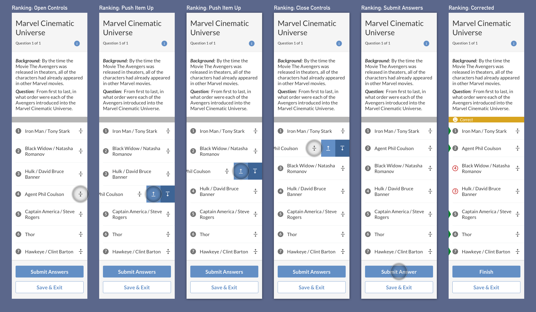
This prototyped wireframe is for a simple “put these items in the right order” interaction. Interaction Flow:
- Start the Test.
- Acknowledge the general instructions for the “question type”.
- Instructions may be reopened if needed.
- Test may be exited at any time.
- Add items from the bin to the list.
- Reorder the items afterwards if interested.
- Submit and get results.
